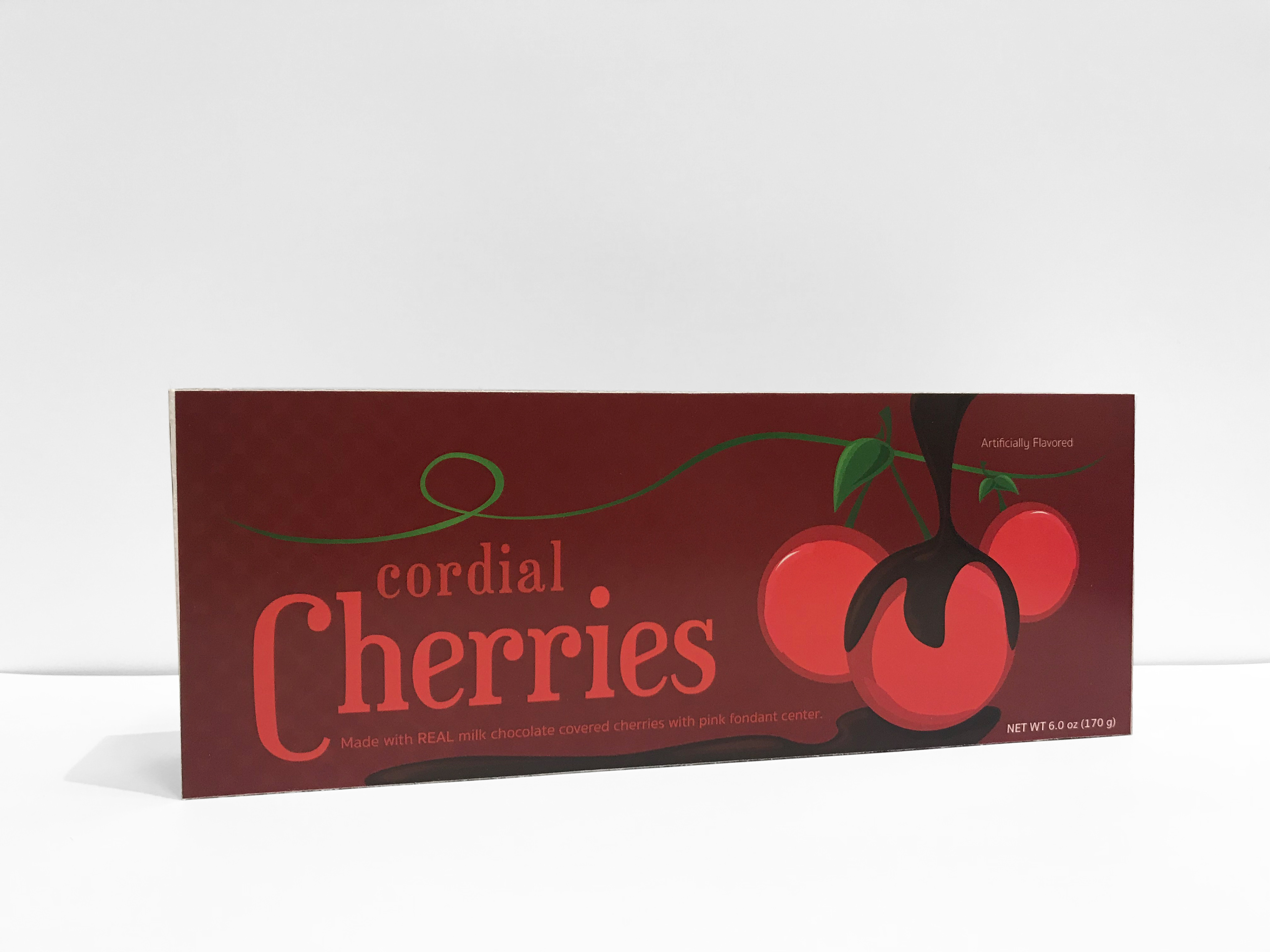
Cordial Cherries
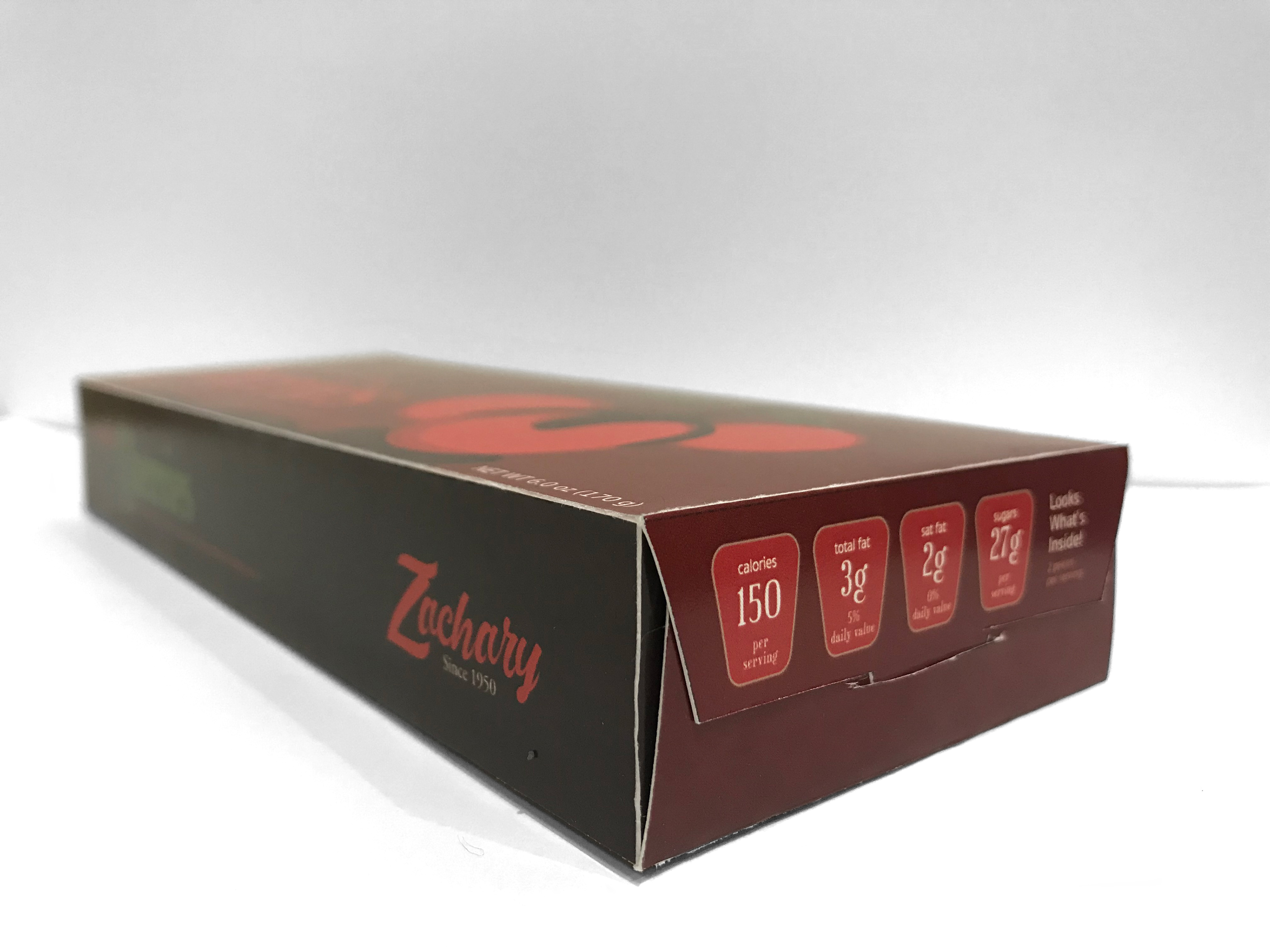
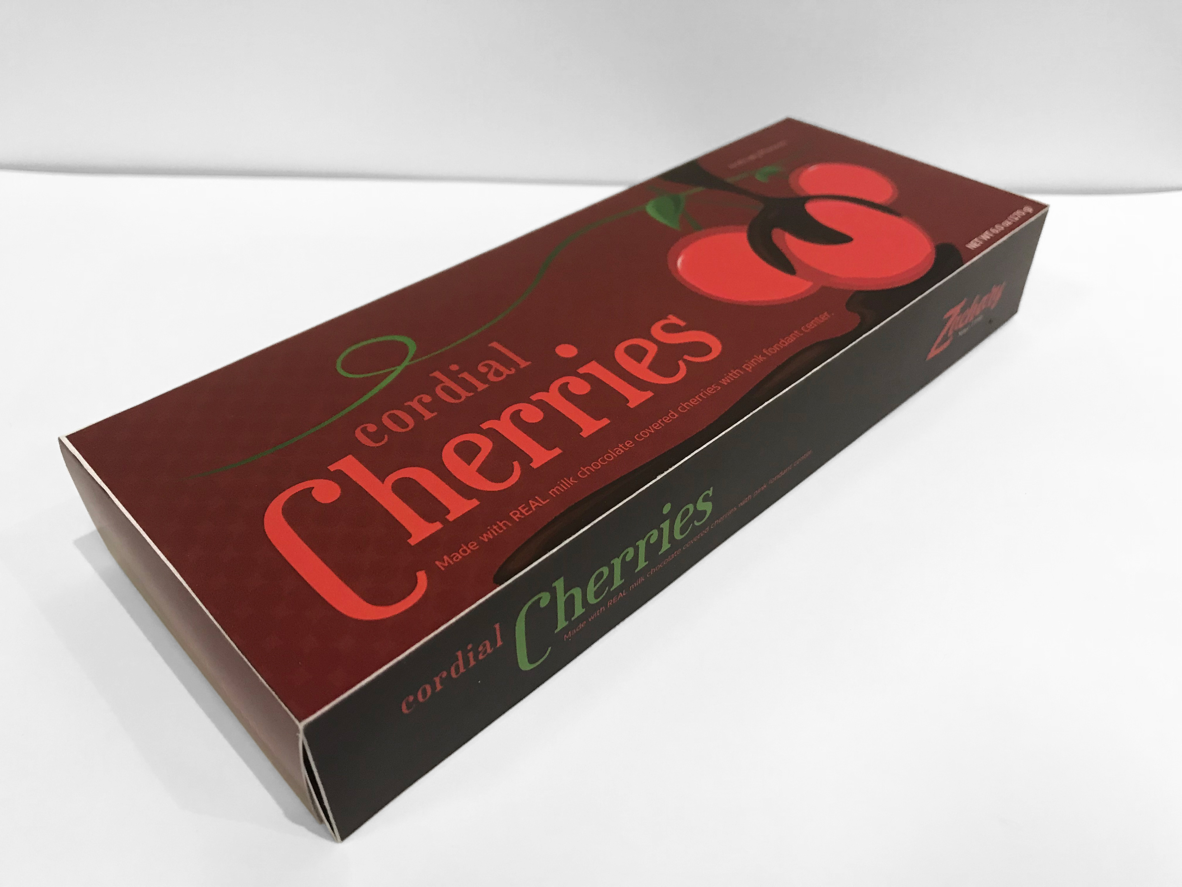
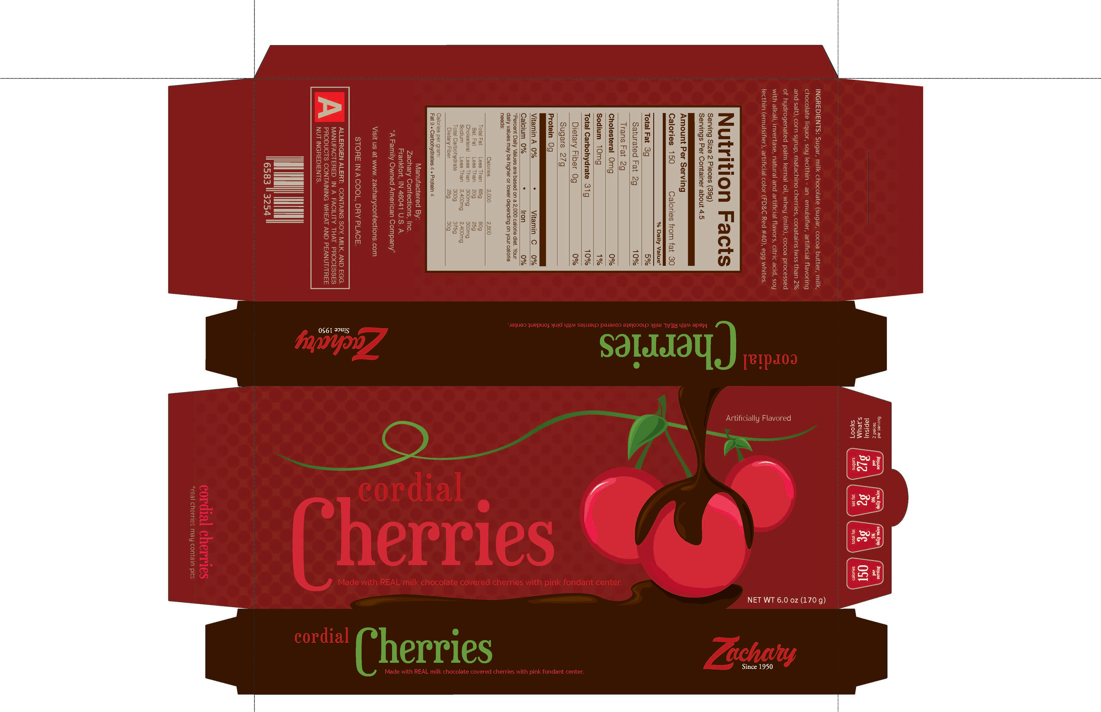
The last of my three Graphic Design 2 assignments was a rebrand and repackage of any package we found to be interesting or exciting for us. I choose to do Cordial Cherries as they are very popular during the holiday season and their package doesn't have a lot to give. What I saw from the original was an old school 90's take on a popular treat. So I decided to use a similar color palette but with a twist. I brightened the red, darkened the browns for a greater contrast, and added an illustration instead of a picture. This made the tasty old holiday treat in to a fresh modern day chocolate.